iOS Fuji
Productivity Focused.

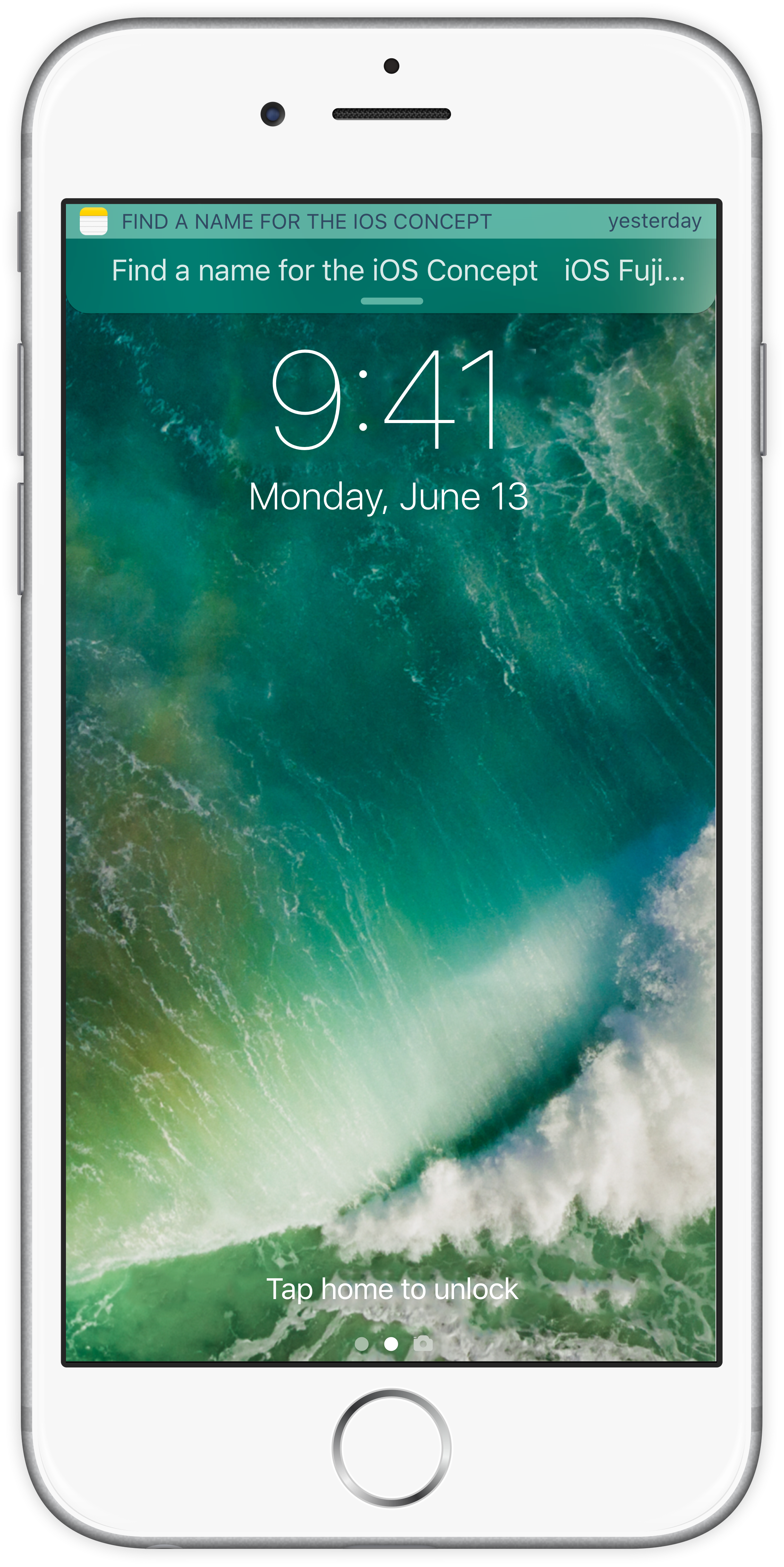
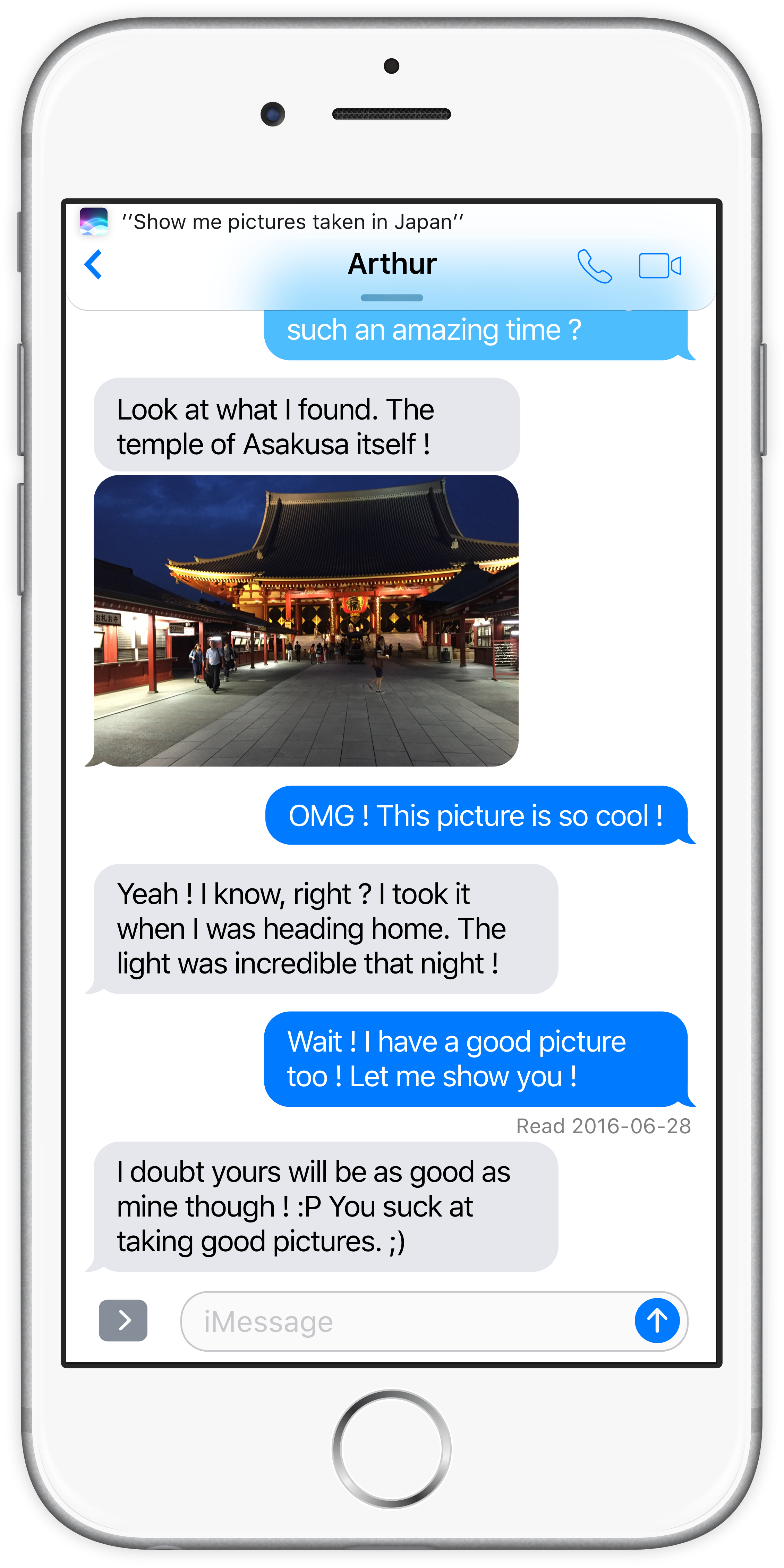
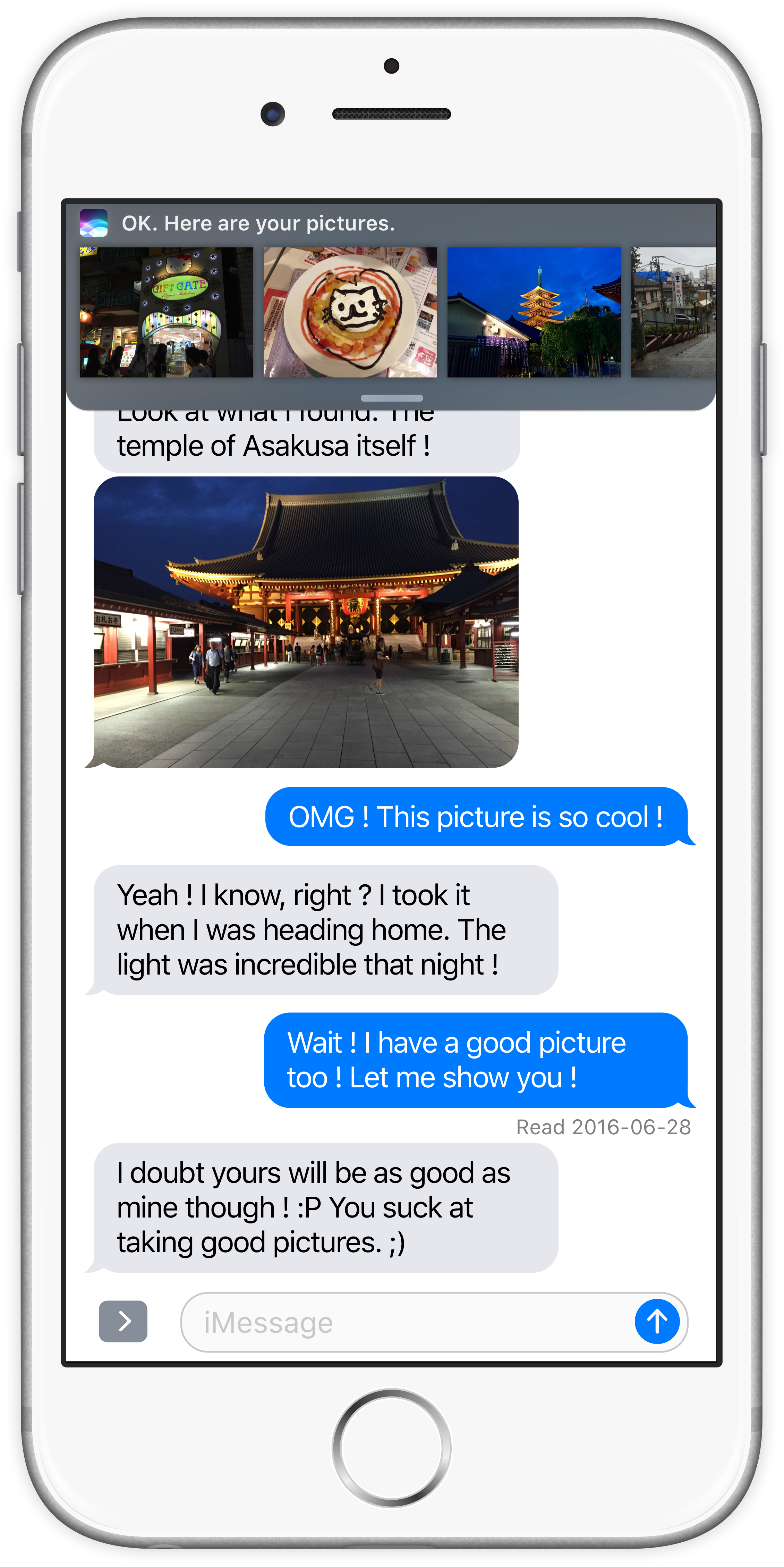
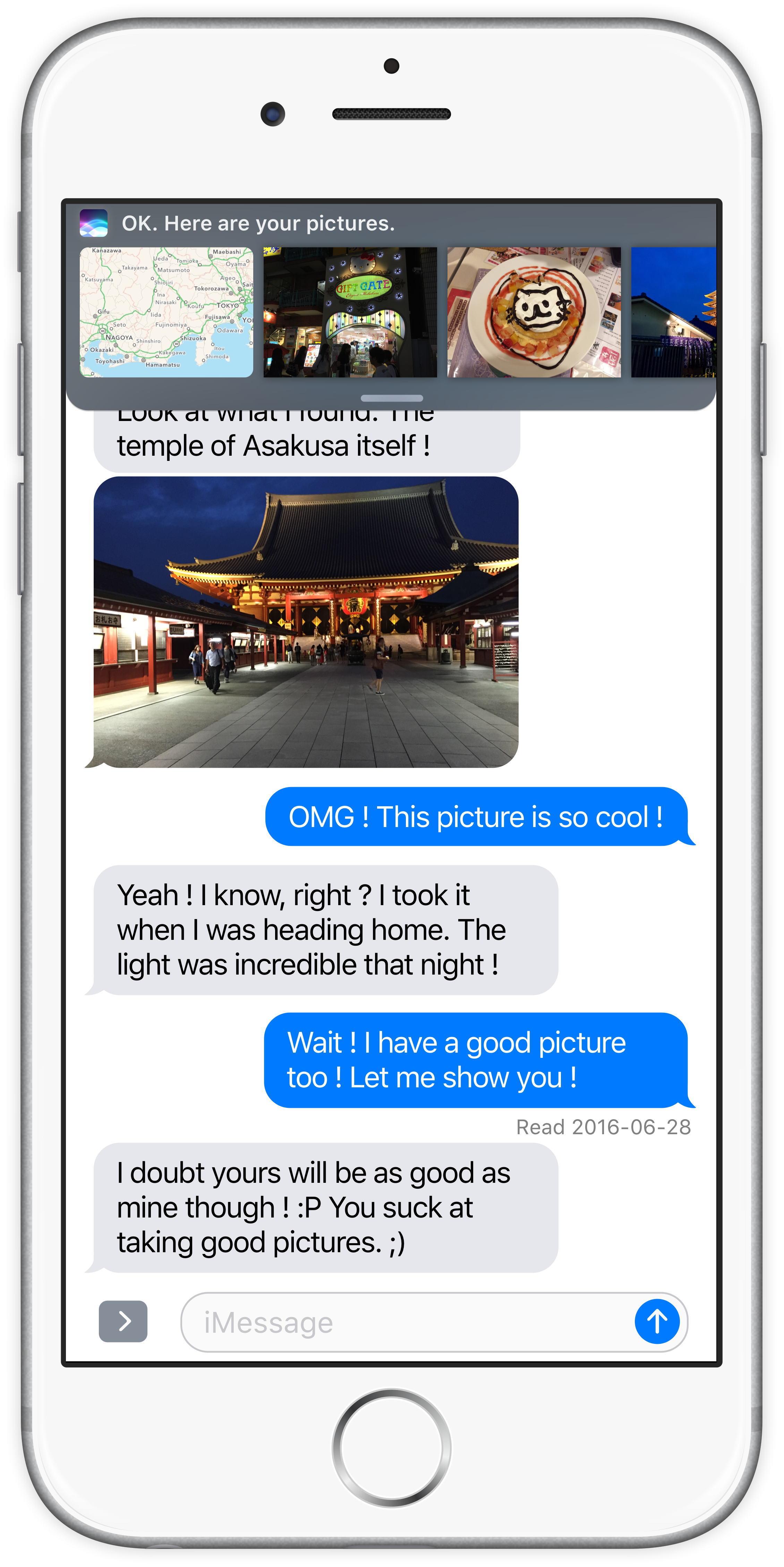
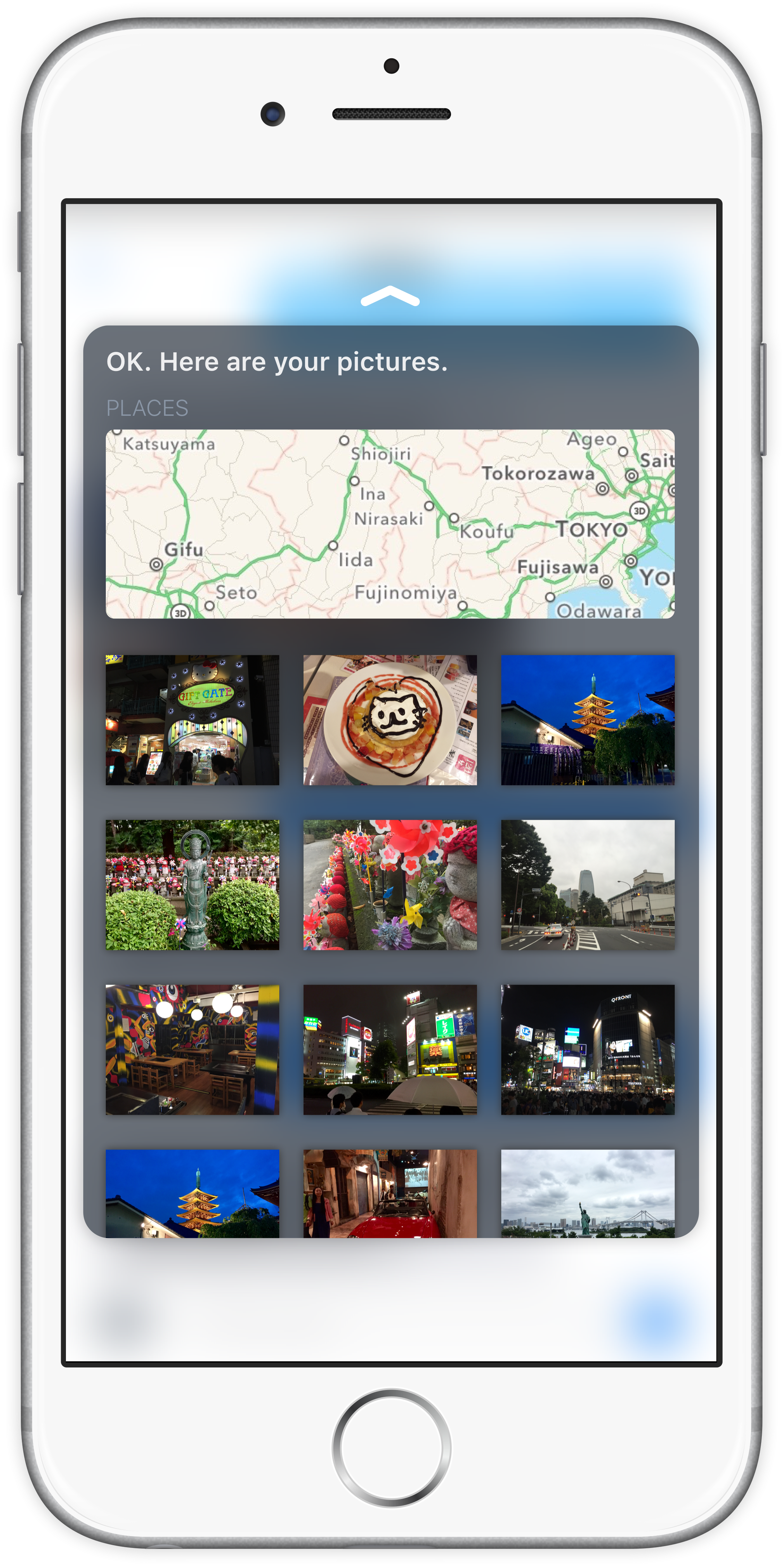
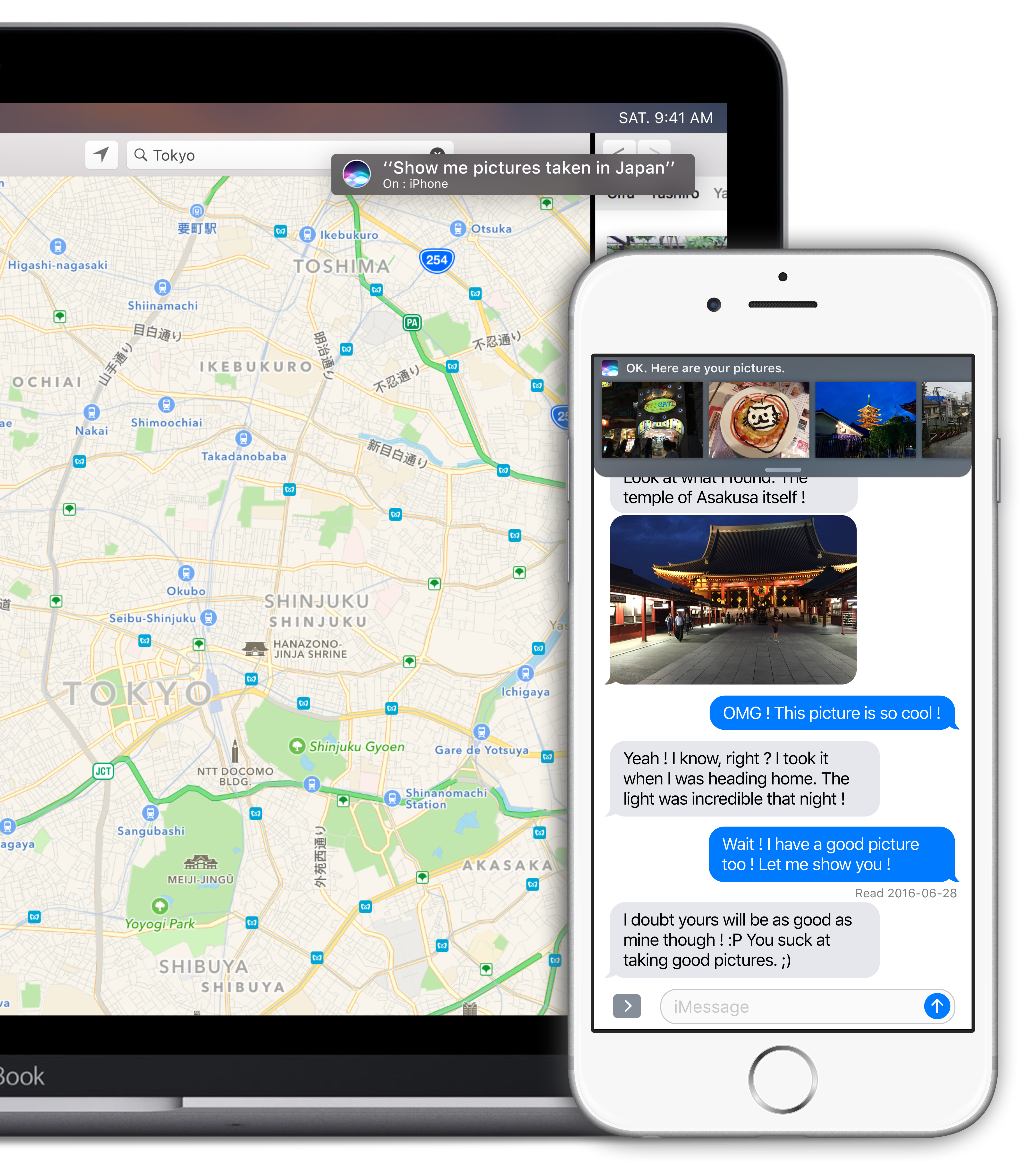
iOS Fuji is a brand new concept that focuses on productivity. Thanks to new, innovating and fun ways to interact with the smartphone, the user is empowered by new tools bound to make their life much easier and more productive.

Coming... Someday

PickPad 
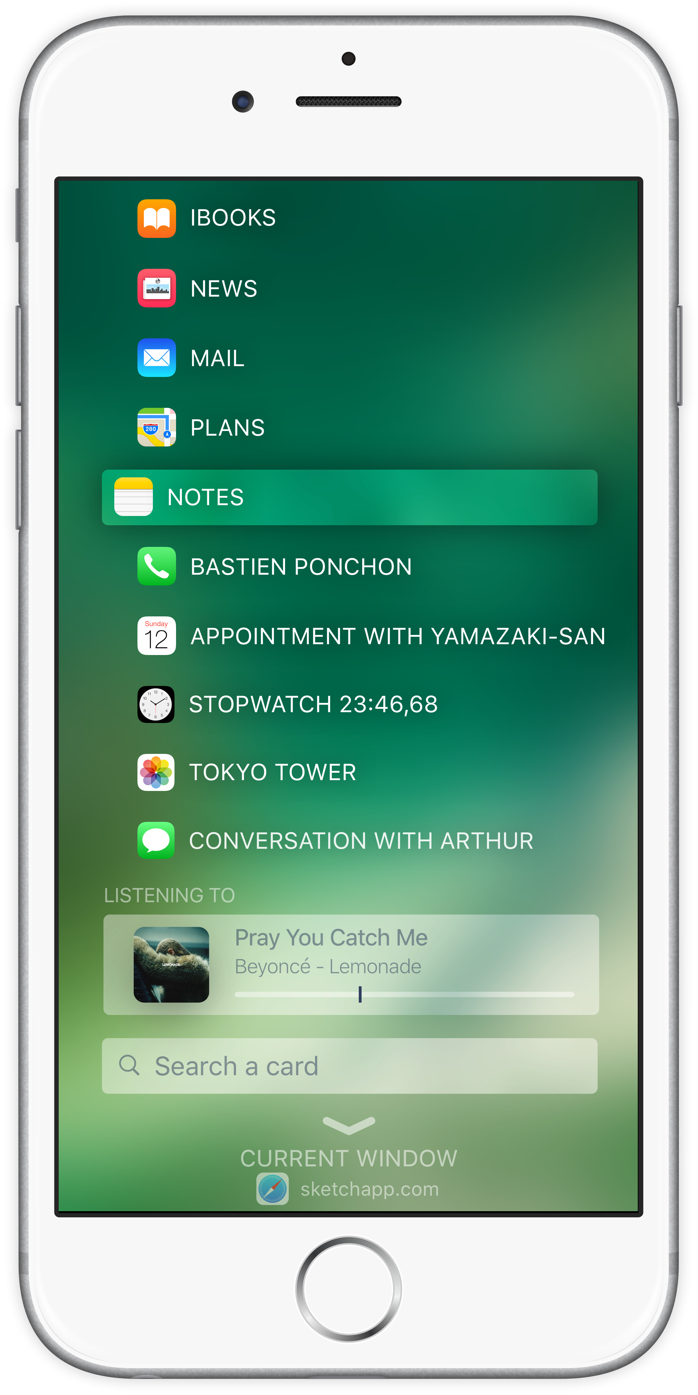
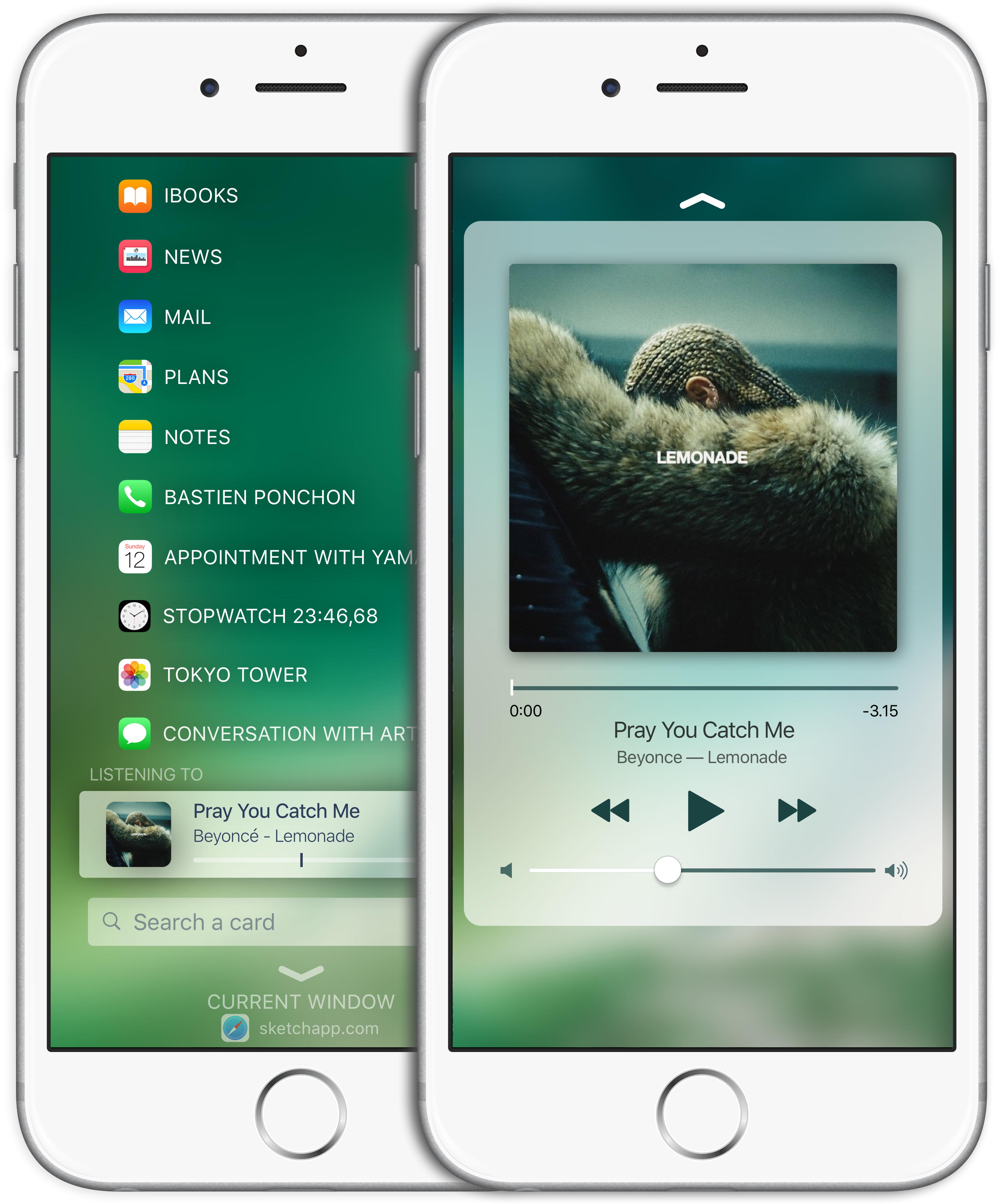
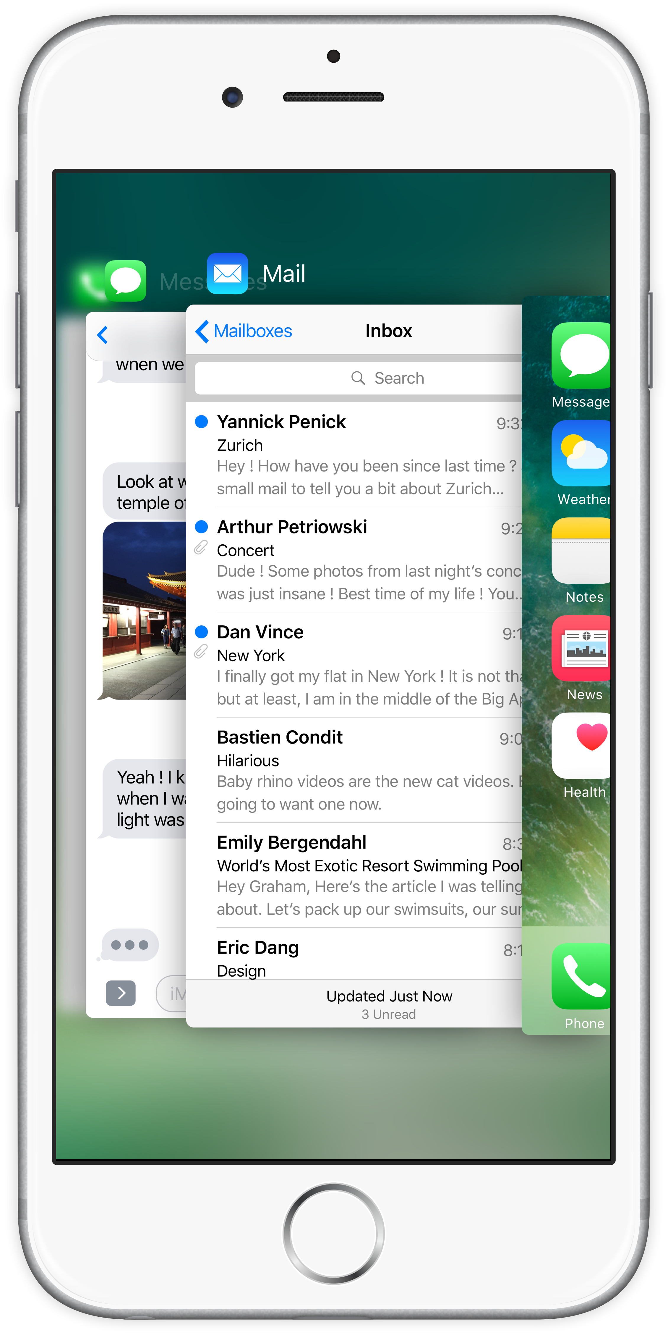
The next generation of Home Button.

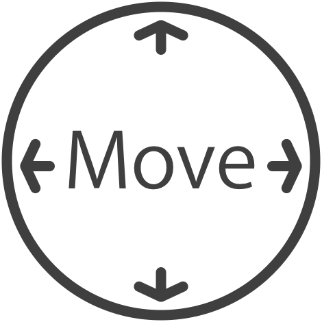
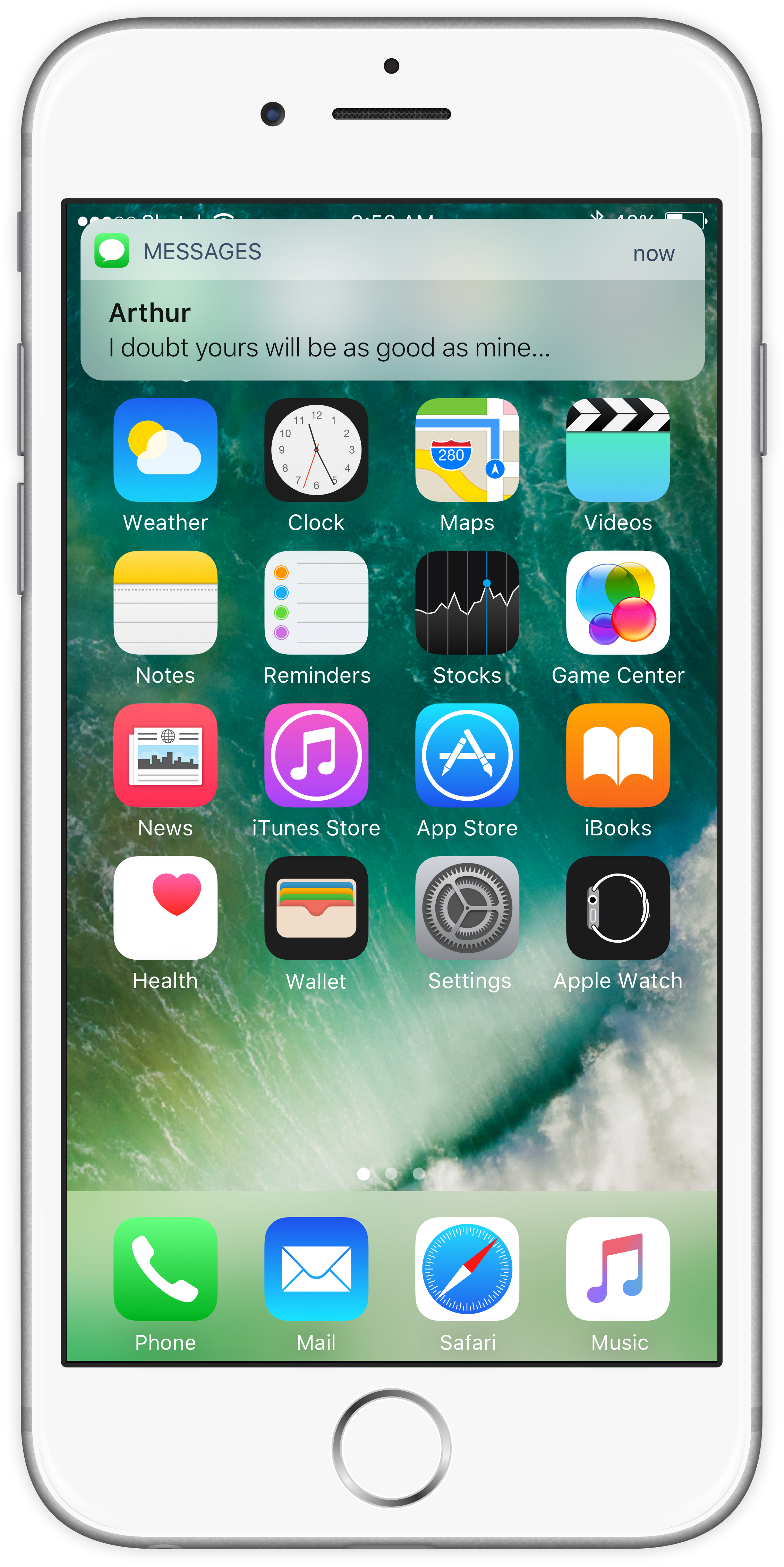
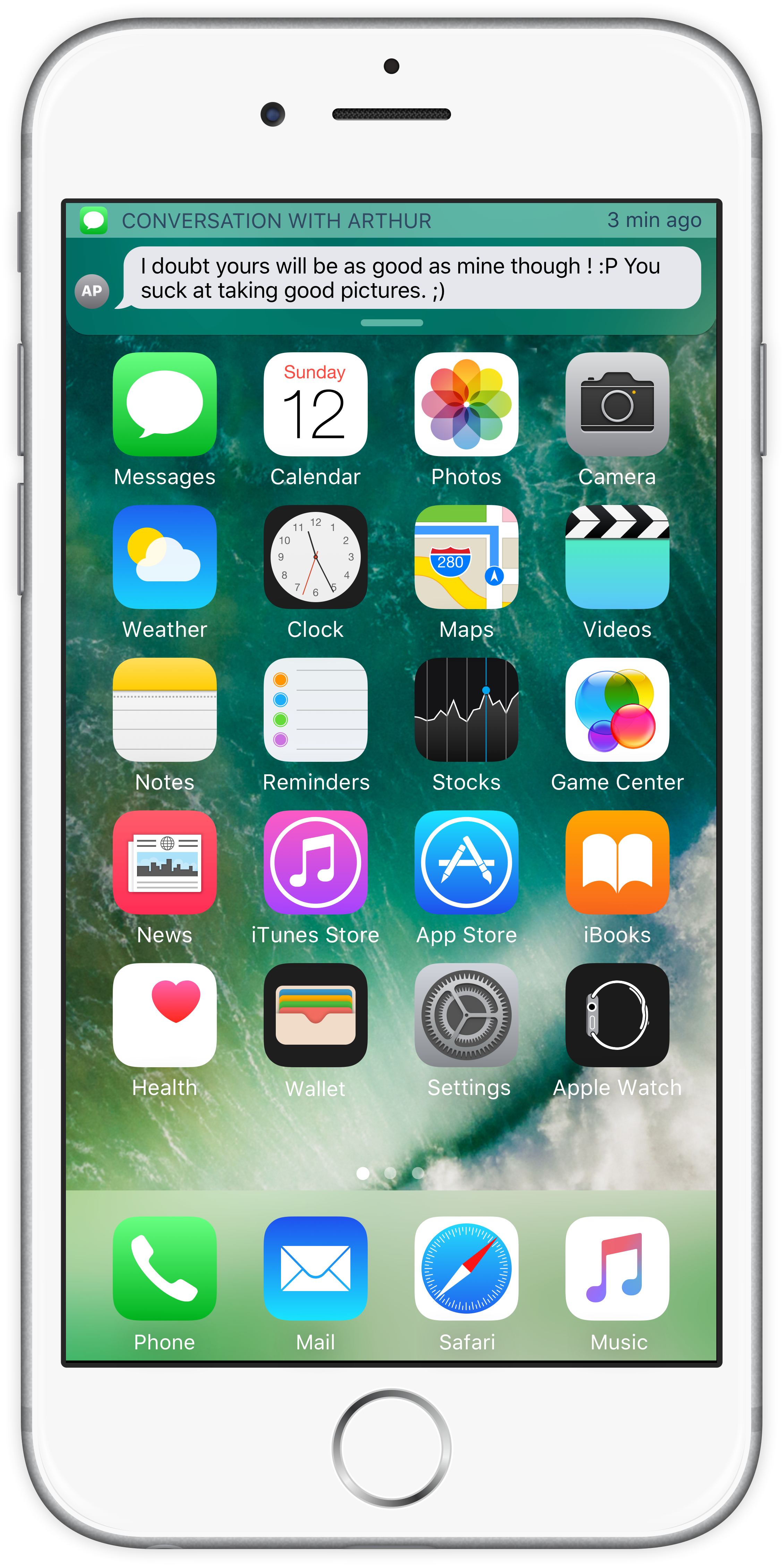
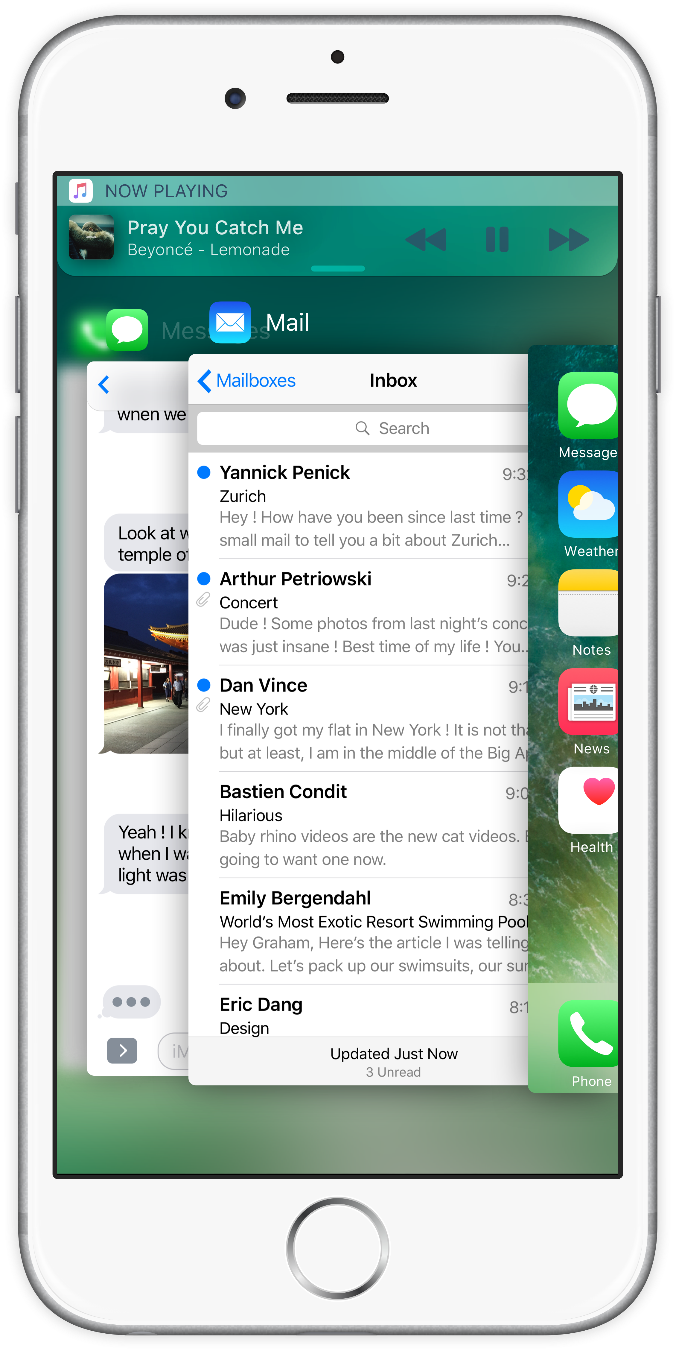
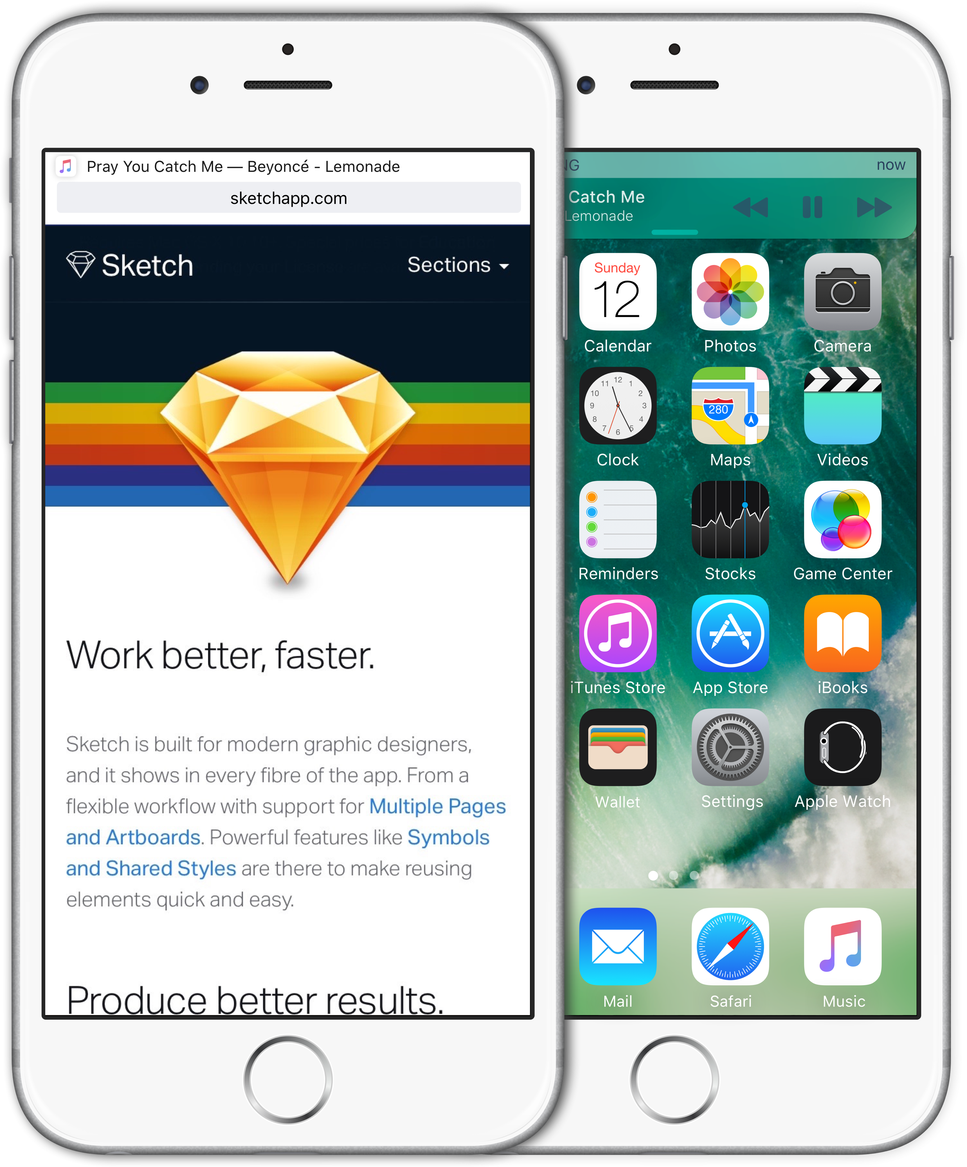
We use the Home Button for a lot of things: turning on the iPhone, going back to the SpringBoard, opening the Multitask, summoning Siri. And now, since iOS 10, we use it to unlock the iPhone. What if we could do even more with it ?

The PickPad is the new Home Button. It is sensitive to pression and direction. Just by adding these two simple features to the Home Button, many more things can be achieved in a very short time. The purpose of this web page is to expose what things.

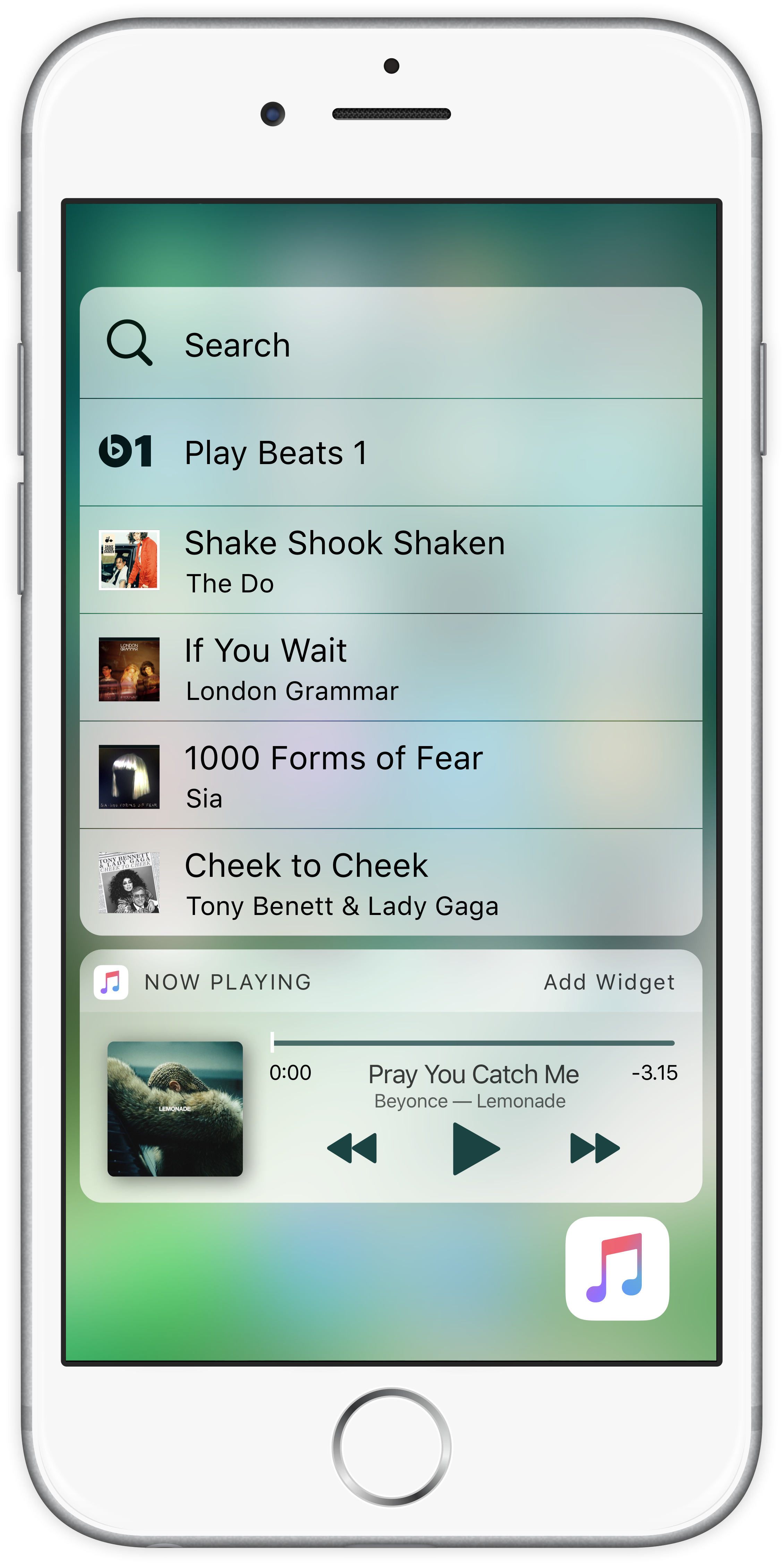
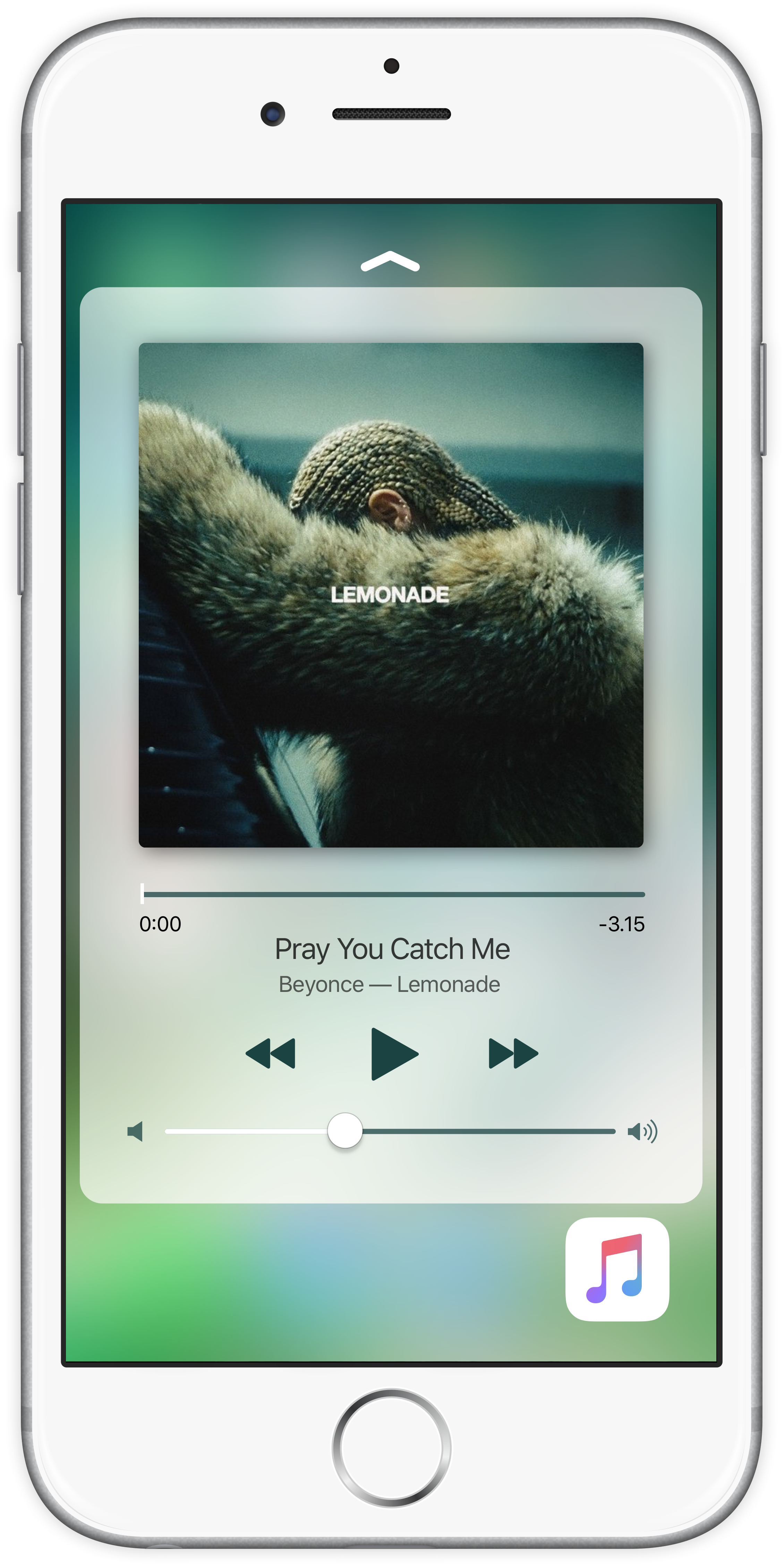
But first, a quick look at the new gestures available.

PickPad

Turning On. Quit.

Tapping the PickPad while the iPhone is on standby will turn it on. Elsewhere, it means quitting the current window.

Navigate.

The PickPad recognizes small moves of the thumb in four directions. This enables the user to navigate throughout the UI without even raising the thumb.

While in Pick Mode

Peek and Pop.

While an item is selected, click to summon Peek. Click harder to summon Pop and react on the screen.

Pick.

Letting the thumb on the PickPad will summon Pick, a mode where the items on the screen can be selected using the PickPad. The iPhone will respond with subtle taps located directly under the thumb.

Change Page.

Big swipes on the PickPad will be interpreted by the iPhone as swiping pages. For instance, going from one conversation to another, or from one song to the next.

All in all, the PickPad is a way to extend the possibilities when using the Home Button - that is, moving the thumb away from the screen. The promise of using the iPhone with only one hand has never been so close.

Some Thoughts about PickPad. And some rumors.

While building this concept, I spent a lot of time thinking about how to make the move of the thumb from the screen to the Home Button meaningful: if one has to do such a long move with their finger, then it has to be in order to do something more than just quitting an app. The whole idea relies on trying to find the perfect balance between the actions made with the fingers on the screen and those made with the thumb on the PickPad. One has to think indeed about how to minimize the number of travels between the display and the PickPad so as for it be really productivity-oriented.

I still believe that the Home Button needs to be physical. There have been several rumors that go in the sense of its integration to the screen itself in future iterations of the iPhone. Yet, having a fully digital Home Button may lead to numerous unwanted manipulation errors when holding the phone. One must feel the Home Button without even having to look at it. But again, it depends on how it is done.

Now that you start to feel what PickPad is, let us dig deeper into the rich possibilities of interaction it enables. It all starts right from the beginning : the Lock Screen.

The Lock Screen

With the release of iOS 10, Apple has dramatically changed the way the Lock Screen works. By a fortunate coincidence, they made it similar to what I am going to propose you now.

The idea is the following : why should we bother unlocking the iPhone when most of the tasks could be done directly from the Lock Screen ? If I have several notifications displayed on the Lock Screen, I want to be able to react right away.

In fact, this very idea led to the concept of PickPad. Indeed, if we want to have some interaction with the Lock Screen, then the user needs to be autentified. But the rich possibilities enabled by 3D Touch, such as Peek and Pop, would not be possible given that the screen is not able to identify the user (yet… although it may not be desirable. See above « Some thoughts about PickPad »). But there is an authentification tool on the iPhone, right under the screen, and it is called Touch Id.

Combining the possibilities of Touch Id (especially now that it is faster than ever) with a Home Button sensitive to pression and direction is a possible solution. This is, essentially, how PickPad was born.

Let us see how it works.

Turning on the iPhone. With PickPad, turning on the iPhone becomes a whole different experience. Simply put your finger on the home button and leave it there. Pick will activate itself and allow you to pick a notification, directly from the Home button. Each time you will select a notification, you will feel a subtle tap directly under the thumb. And if there’s no notification, the iPhone will take you directly to the Springboard.

Peek and Pop. Once the notification is selected, slightly press the Home button to summon Peek and have a look at the whole conversation. And if you feel like it, press harder to answer. Since Touch Id is directly integrated to the PickPad, you are authentified on the go and have access to anything that you want, right from the Lock Screen.

Knock Knock. When on the Lock Screen, or if the iPhone is turned off, if a notification comes in, it takes the whole screen just as on the Apple Watch. The user only needs to click the PickPad to peek at it, and click harder to answer. This view is disabled if the user activates Pick, so that they could select other notifications.

PickPad really takes the most out of the two worlds: the simplicity and speed of unlocking with Touch Id on the one hand, and the interactivity of the Lock Screen introduced in iOS 10 with rich notifications on the other. It is a smooth, elegant and unique experience.

Notifications Right under the thumb.

PickPad enables the users to quickly react to notifications, using only one hand and with very useful and simple gestures.

A notification comes in. Traditionally, one would pull the notification down to answer it or 3D Touch it in order to view the whole conversation. However, the position at the top of the screen makes it uncomfortable for the user who has to stretch their thumb to the top, or use the other hand, to be able to react.

PickPad solves this problem. When a notification pops up, all you have to do is to click on the PickPad to summon Peek. If you want to react, click harder. Once you are done, you get back to exactly what you were doing before the notification came in. You wonder what the small up arrow is there for ? Scroll further and you’ll get the answer.

This simple gesture - select an item with the PickPad, and click to open it - is consistent throughout the whole UI. When a notification pops up, it is as if it was already selected. To dismiss it, just tap on the PickPad.

Usages Scroll. Select. Zoom. And many more.

PickPad can do so much. It enables users to do many things without even having to raise their thumb from it. Once Pick is activated (ndlr: by leaving the thumb on the PickPad), you are able to take action on the current opened app. Pick de-activates itself if you put away the thumb.

Here’s a quick glimpse at some of its features.

Select. You can use Pick to select independently the items that you see onscreen. Like mails, conversations, news, etc.

Scroll. When looking at a conversation, or surfing the web, simply put your thumb on the PickPad and move the finger up and down to scroll vertically.

Video Controls. Click to play or pause the video. Move the thumb to the right or to the left to play the video forward or backward.

Switch Conversation. Swipe left or right to switch from a conversation to another. Or from a mail to another.

Answer. Click to quickly send a message to someone. Click harder to see all your recent conversations.

Opening the keyboard. Swipe up or down the PickPad to open or dismiss the keyboard.

Zoom. Move the finger up and down to zoom or dezoom. To take a picture, simply click.

Cursor. Use the PickPad to easily select text. Click to start selecting, move the cursor by moving the thumb, and release when done.

SDK for Developers.

PickPad comes along with a SDK, so that developers may use it the way they want to. As an example, we can imagine using PickPad as a joystick in video games. The possibilites are infinite.

Cards Reinventing Multitasking on a smartphone.

The concept of cards lies at the core of iOS Fuji. This is where PickPad and its integration into the iOS UI-UX takes its whole meaning. By trying to find the perfect balance between the actions made onscreen and those made using the PickPad, one makes sure that the user experience is as smooth as can be.

With the concept of cards, I propose an alternative handling of apps on a smartphone, one that is productivity-oriented, that is, the capability of doing many things in a short period of time. Some say that smartphone screens should be split in two or more so that users may be able to simultaneously complete several tasks. However, on such a small screen, I hardly see how this can truly be efficient. We cannot simply see smartphones as small computers (although, from a technical point of view, it is undoubtedly the case). Smartphones and computers are two worlds apart in the sense that the user experience truly differs from one type of device to another. Moreover, we do not use smartphones and computers for the same purpose. A designer must definitely take into account these facts when designing new interfaces or experiences.

Cards are alternate versions of apps that do not fill the whole screen and are quickly interchangeable.

Let us see how this works in details.

From app to card

Let’s say I am having a conversation with Arthur. While I enjoy speaking with him, I also want to be able to do other things on my smartphone. However, given the fact that apps take the whole screen when opened, it may prove bothering to regularly switch from one app to another. This is where Cards come into play.

To change an app to a card, I simply double click on the PickPad. The card, in its peek version, takes the upper part of the screen. The name of the card temporarily replaces the status bar, so that the user is reminded of the context. iOS Fuji takes me back to the SpringBoard so that I can choose another app among those that are on my device.

After a while, the name of the card disappears and the status bar takes it previous position. Notice how the apps shift down a bit, so that no app may be hidden by the card. There should be some adjustment made when opening a card concerning the size of the app icons, so that they may all fit in one page.

Multitasking

I choose to open Safari. Safari pops up as expected, and the card « Conversation with Arthur » is still up there. The Safari UI shifts down enough so as not to be hidden by the card. Notice how the card respects the aesthetics of the Messages app. This way, Cards give the same feeling as the original app it comes from.

I can expand the card in order to see more content by drawing the card with the finger onscreen, or by pressing hard the PickPad. This time, the card hides parts of the app below. When I release the finger, the card retakes its initial size. The content of the card is live; for instance, in this case, the conversation updates itself as it would in the Messages app.

If I draw up to a certain point, or if I press hard enough on the PickPad, the card is fully opened. The card takes position above the current app and is fully usable as a normal app. When I’m done with it, I can just swipe it up and get back to my initial state.

Cards Browsing

I want to change the card currently used into another. By long pressing the PickPad, I open this view, which is essentially a history of the cards recently used. Using Pick, I then choose among the proposed cards. Here, the card « Notes » is chosen. Notice how the UI has been thought to be used with PickPad : the small hitboxes for cards (only text) are a call for Pick, where big windows would be a call for touch interaction.

Once the card « Notes » is selected, I release the finger to open it. The card goes fullscreen, encouraging me to touch it instead of using the PickPad. I now need to define the context, that is, where I want to be within the card. I choose the first note « Find a name for the iOS Concept ». If I activate Pick, I go back to the previous screen and am able to select another card. I can also swipe left or right to change the card. In fact, cards can be thought of as a new way of going from one app to another, as a replacement for the traditional multitask view. In other words, usages are multiple and flexible.

Once I am satisfied with the context (here, the note starting with « Find a name for the iOS Concept »), I swipe up the card or click the pickpadto minimize it and put it at the top of the screen.

Summoning a card

To summon the last used card, simply click on the PickPad, without activating Pick. And, because Touch Id is directly integrated, this gesture and the cards browsing view are accessible right from the Lock Screen.

On the SpringBoard, if you press hard on an icon, you summon Quick Actions. If you press harder, you open the associated card.

Interaction

Cards enable rich interactions between apps. Let’s say I want to write an e-mail to Bastien and send him the picture Arthur just sent me. With my card « Conversation with Arthur » opened, I simply open Mail and start writing my message.

Once cards are expanded, any item (images, bubble conversations, websites, notes, videos, etc) from any card can be dragged on the app below by pressing hard on them. Here, I choose the picture of the Asakusa Temple : I press hard on it, the card is reduced and the image is ready to be put where I want on the app underneath (here, Mail).

I drag the image to my mail, and release when I am done. The image is ready to be sent, and I did it without ever quitting my mail.

3D Touch

Quick Actions are compatible with Cards. When using Quick Actions, one actually summons the dedicated card, so as to be able to use the app without actually opening it.

Inside apps, if one uses Peek, they can swipe up to have more options. If they swipe further, they will transform the preview into a card that can be used for later purpose. For instance, if I peek at a mail and want to answer it later, I can transform it into a card so that it may be accessible from anywhere in the Cards Browser.

From card to app

Of course, it is possible to change a card to an app at anytime. Simply press hard on the screen - on a place where there is no item - to do so. The corresponding app will open with a deep link leading to the previously opened app.

Rules

Now that you know what Cards are about, let us point out some important rules about them.

The name of the cards are written in upper letters, so as to distinguish them from traditional apps.

To prevent confusion and disorder, there should be only one card per app.

Cards are context-sensitive, which means they adapt to their inner content, unlike apps.

After a while, the context disappears, as it may not be relevant anymore after a certain period of time.

Music Always On.

Music should be at the core of the iOS experience. There should be ways to have a quick and easy access to Music, wherever and whenever. We need to be able to change the album, the artist, the playlist, as fast as can be.

iOS Fuji has a solution: Music is a card.

Cards Browser

Reachable Player

When opening the Cards Browser (ndlr: by long pressing the PickPad), the Music card is already selected. Which means that one has only to release their finger to fully open the music player. The music card is special in the sense that it always stays at the bottom of the cards browser view, so that it may always be easily reachable by users.

While a music is being played, if you open the MultiTask, the Music Card will pop up so as for you to easily reach your music from anywhere.

If you press hard on the Music icon on the SpringBoard, you open a small player so that you can control your music without opening the Music app.

If you press harder, you open the Music Card, so that you have better control on your music. To change the album, swipe the album picture and tap on it to confirm. To change the song, swipe the name of the song.

Music Card

Keeping up with the tune

Whenever a new song is played while you are inside an app, a subtle notification pops up at the top of the screen, letting you know about it without disturbing you. Just click on the PickPad to open the card and skip the song or play again the last one. On the SpringBoard, the Music Card opens up automatically.

Continuity

Control the music on your iPhone from your Mac.

The Music Card is now compatible with Continuity. When a music is being played on your iPhone, you can control it from your Mac. Or, you can keep on listening to it on your Mac. And vice versa.

New Siri

Redefining Vocal Assistants.

With iOS 10, Siri is now open to developers. As the number of functionalities will continue growing, it is expected that people will start to use it more and more. Therefore, we need to rethink the way Siri works in order to support this growth.

Siri should act as a true assistant, that is, it should help users fulfill their tasks much more easily were they not using it. In other words, Siri should be able to work alongside the user’s actions, not try to replace them.

Let’s see what’s new.

''Hey Siri, I want to...''

First of all, as you may have noticed, in iOS Fuji, long pressing the Home Button does not summon Siri anymore (it opens the Cards Browser instead). Calling a vocal assistant should be done vocally solely.

In iOS Fuji, we can ask Siri to prepare specific cards so that they may be instantly available to the user. For instance, say that I want to write a message to Arthur, and that my iPhone is laid on the bed out of reach, turned off. I only need to say « Hey Siri, I want to send a message to Arthur » for Siri to prepare the dedicated card for me to indeed write the message once I have my phone in the hands. Combined with the « raise to wake » functionality introduced in iOS 10, this truly is an elegant and handful feature. (i.e. Siri confirms vocally and thanks to a little jingle that the card is ready to be used. The card is displayed onscreen only when one takes the phone.)

Siri reveals its true potential when using earphones. It is so convenient to be able to use his smartphone without even getting it out of the pocket. Here are some handful features that may prove really handful.

When listening to music, there are three gestures currently available : one click means play/pause, two clicks means playing the next song, and three clicks means playing the previous song. In iOS Fuji, in order to prevent manipulation errors that very often happen (for instance, if the beginning of a song is soft, one can hardly know whether it is actually the next song playing or if it’s the music that stopped), each of these three gestures comes along with a jingle that lets the user know how the gesture was interpreted by the OS. One click - one note jingle. Two clicks - two notes jingle. And three clicks - three notes jingle. And if you long press the button, Siri tells you what music you are currently listening to.

In iOS Fuji, if you receive a call, Siri tells you directly in the earphones who is calling. And, if you receive a message or an email, he lets you know who the sender is, and asks you if you want to reply (one click means yes, two clicks no; or, you can just say it.)

Siri becomes a card

In iOS Fuji, Siri works differently from before. Instead of taking control of your phone and preventing you from acting, it works alongside what you’re doing and helps you in your current task.

In order to make Siri go multitasking, Siri becomes a card.

The former operation of Siri (a whole screen dedicated to Siri) can still be found when you are doing nothing — that is, on the SpringBoard, or from the Lock Screen. If so, double click on the PickPad to transform Siri into a card, like any other app.

I want to send Arthur some good pictures that I have taken in Japan, to show him that I am capable too. I could search in the bottom drawer, but it would take too long, and wouldn’t be very convenient. Instead, I can ask Siri to find the pictures for me. I just ask « Show me pictures taken in Japan » to Siri; the request replaces the status bar so as not to disturb what I am currently doing.

Once Siri has found what I asked, the Siri card opens and displays the wanted pictures. I then can scroll among the pictures and choose the ones that I want by tapping them, or by hard pressing them (as shown before) to directly send them to Arthur.

I can scroll to the right to select among the different locations available, and choose only the pictures from a particular place.

I can also expand the card so as to display more pictures and select the ones that I want. Once I am done, I only need to swipe the card up. The images are ready to be sent.

When using Siri on your iPhone, the results are automatically displayed on your Mac. So you can use them in a document you are working on on your Mac for instance. Or continue your requests to Siri on your Mac.

Snapshot

Taking screenshots and using them in iOS Fuji is easier than ever. Once the screenshot has been taken, the Snapshot Card opens for a while and lets you use your screenshot anywhere you want. For instance, if you want to send a screenshot to a friend. Or keep an eye on something important. And, of course, the Snapshot Card is also automatically available on your Mac, so that you may use the screenshot in any document you are working on.

Pick-a-Task An evolution of the MultiTask.

Pick-a-Task is an evolution of the current MultiTask. It offers to users a much more precise scope of action. The basic idea is that, within apps, several tasks are achievable. It can be writing an email, checking a mailbox, and so on. Pick-a-Task allows users to choose, right from the MultiTask view, which task to achieve.

In iOS Fuji, to open the MultiTask, one has to press hard on the left part of the screen (a double click on the PickPad transforms the current app in a card, or interverts the app and the card if the card is fully open).

When the MultiTask view is open, if one swipes up an app, they transform it into a card that can be used for later purpose. To quit an app, simply double tap on it. Note that this gesture is also possible if one wants to close a card.

To choose a task, press hard on an app. The other apps fade away and a small up arrow appears, indicating to swipe up.

Swipe up to make appear a submenu where all the tasks available within the app are shown. The more you swipe up, the more the selector goes down. To confirm the selection, just release, and iOS Fuji will take you right where you wanted.

Many usages can be thought of. Like choosing among the recently played albums. Selecting a recent note. And so on.

I press hard on the Music App in the MultiTask view and swipe up to highlight the recently played albums or songs.

To confirm the selection, release the finger. The chosen album starts and iOS Fuji takes you to what you were doing before, without opening the Music App.

The Small Things

We all know that the devil is in the details. The small things are what makes the user experience stand apart. And while they are bound to make every possible action of the user much more simple, they also prove the commitment and the passion of the designer to propose the best user experience possible.

When listening to music, you can swipe left or right on the PickPad to change the song even if the iPhone is turned off.

In Messages or Mail, the Return key works differently. Start typing the name of the receiver, and press the Return key to confirm the best matching possibility and start writing your message. Long press to add another contact.

If you call someone from the Messages app, you don't quit the conversation so as to continue typing or sending images while speaking.

When calling someone, the loudspeaker is automatically activated if you don't have the iPhone next to the ear, and is disabled if so.

If someone starts writing you an iMessage and you are not in the Messages app, a subtle notification will appear at the top of the screen to warn you. A click on the PickPad will take you directly to it.

The reminders become intelligent. If iOS Fuji detects that a task has been done, such as sending an email to someone, it will ask you if the task has indeed been fulfilled, so that you validate it without opening the Reminders app.

If you watch a video on the Internet, and quit Safari by tapping the PickPad or turn off the iPhone, the video continues by default playing in the background. And while it is playing, by pressing hard on the Safari icon, you can keep an eye on it, or choose among the quick actions available.

The synchronization of the messages between the iPhone and the Mac uses Bluetooth, so that you may receive your messages on your Mac even if there's no wifi connection.

When you delete a message on your iPhone, you also delete it on your Mac.

In a conversation, if you send a weblink to someone, a small checkbox appears on the top of the bubble if the person actually clicked on it and visited the webpage.

If some task is being done in the background, like a conversation with someone, or a video playing in Safari, a small bubble appears below the corresponding app icon. If you press hard on the icon, the widget will show you what is currently happening within the app. This is what I call Informative Design.

You can ask Siri to show you the content of your clipboard within a dedicated card. You can even ask it to send it to a friend while you are doing something else.

You can press hard on the play forward/backward icons to control the fast forward motion speed.

If you leave a task undone — imagine, you started to write a message, or a mail, and eventually did not send it — the task automatically becomes a card so that you don't forget to fulfill it later.

In the MultiTask View, you can swipe down a card to make it update its content so that you actually see what's new before you go there.

You can dismiss the Quick Actions by a swipe up or down according to their position against the app icon.

You can also rearrange the disposition of the Quick Actions by long pressing on one of them and putting it on a position that fits you more.

Pressing hard on the tab icon in Safari will show you the open tabs without quitting the current webpage.

When using the address bar in Safari, long pressing in a Safari suggestion will fill the address bar without going there, so that you can modify it as it pleases you.